

CHIAROSCURO
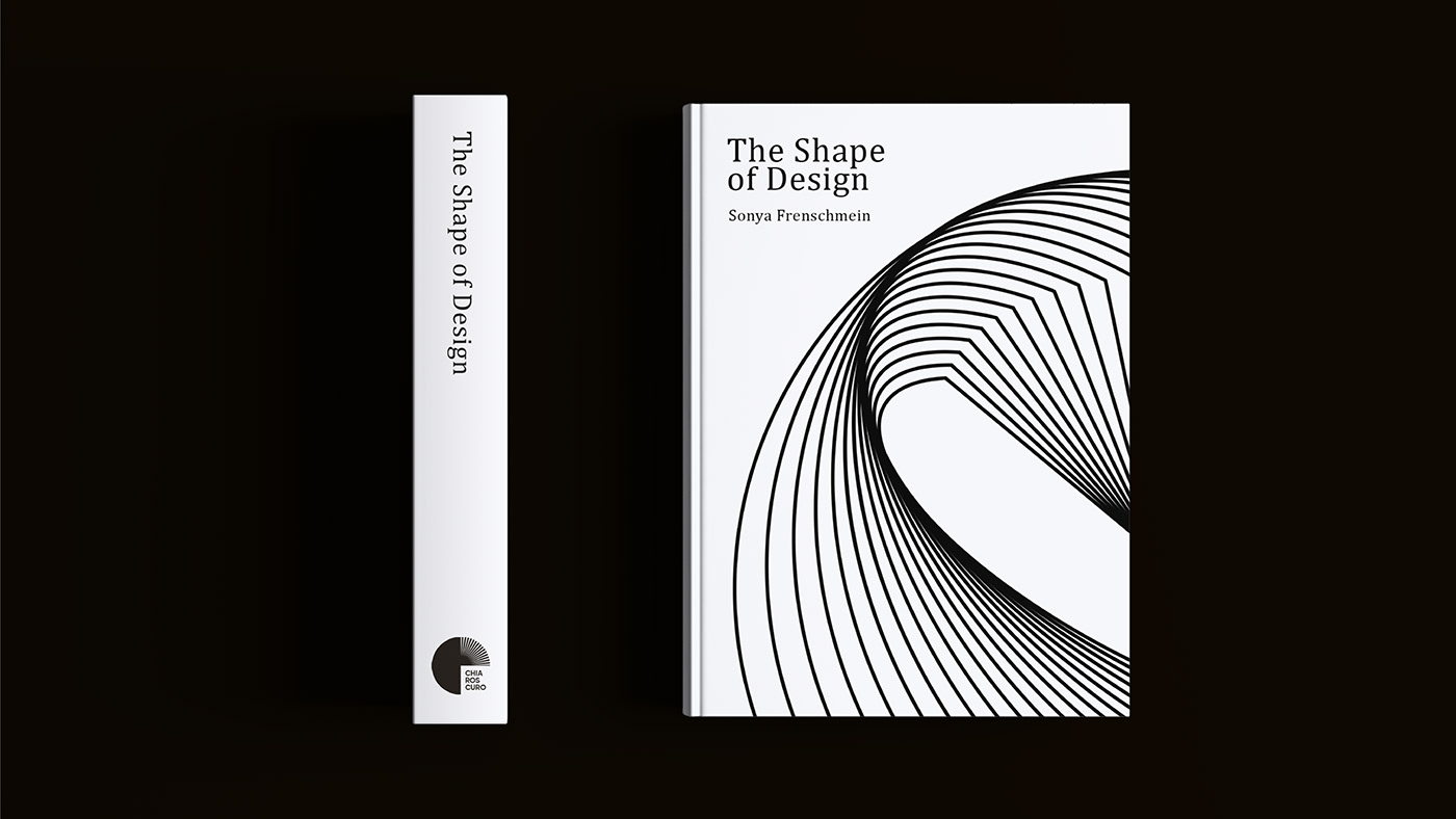
It is a publishing house that publishes books about design, fashion, architecture, and other creative fields.
The target audience are professionals and enthusiasts in fashion, design, architecture, music and other creative fields. They can be students, professionals, artists, designers and anyone interested in modern trends and developments in these industries.

The term "chiaroscuro" refers to the use of chiaroscuro to create contrasts between light and shadow.
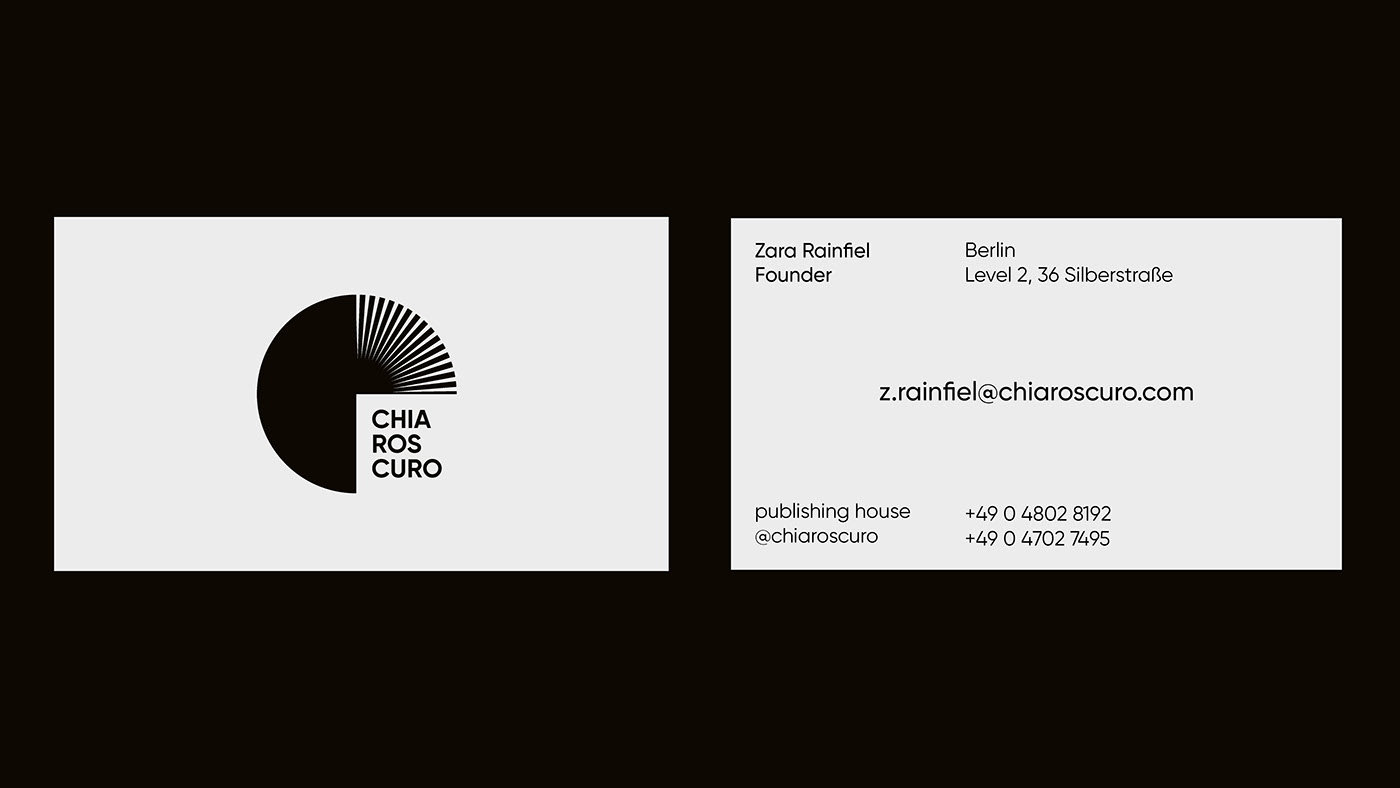
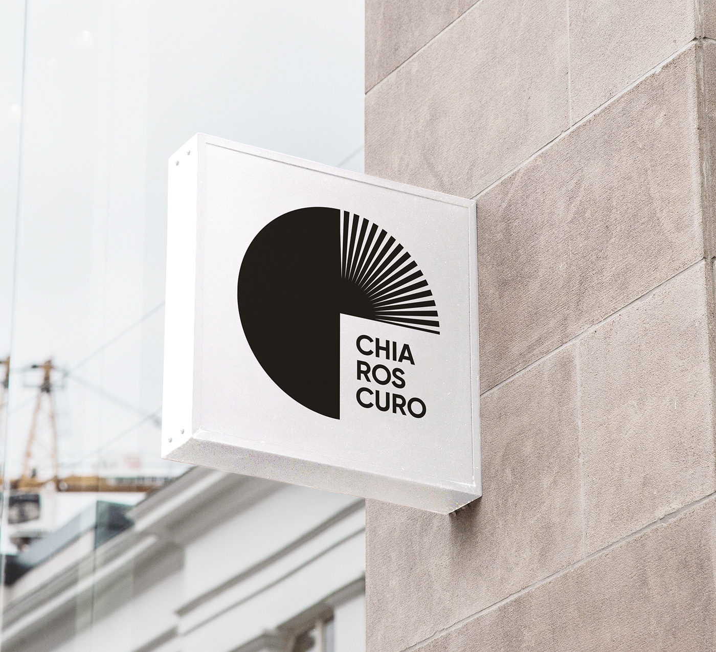
One of the elements symbolizes the flow of light and the turning pages of a book.
Half of a sphere and square will later be used as a key visual elements.


Design by Yana Martynovych
All rights reserved
If you want to work with me write me an email yanaamart@gmail.com


